Everything related to graphics and image-related topics.
-
Fortune
- Ranger
- Posts: 888
- Joined: Sun Oct 04, 2009 1:40 pm
- Location: NYC, baby
Post
by Fortune » Wed Apr 07, 2010 8:13 pm

it's my iPod wallpaper. The style I was trying to go for was simple yet extravagant. I made it because I felt my iPod needed more of a nicer backround, ya know? Discussion go!
Like what did I do good and what you don't like and stuff
also I kinda wanna see your iPod wall papers(if you got dem)
ᕦ( ͡°╭͜ʖ╮͡° )ᕤ
Visiting this website is filled with nostalgia. Its like going to an old home.
Thank you for all the memories. Never change.
-
kiddten
- Commando
- Posts: 2469
- Joined: Wed Sep 30, 2009 1:42 am
- Location: Nova Zeelandia.
Post
by kiddten » Wed Apr 07, 2010 8:35 pm
the glass mosiac thing you got thar is ugly.
the gradient looks a bit off too, feels like it needs to be in the shape of the apple.
kiddten, on most things nowadays wrote:no
TaxiService wrote:HERE IS THE GODDAMN WALDO YOU CHEATING DICK
๖ۣۜĐeяP wrote:U MOTHER FUCKER AND U FUCKING PARENTS AND FUCKED OFF ASS HOLES
-
Sugarlumps
- Ranger
- Posts: 1545
- Joined: Mon Aug 03, 2009 10:42 pm
Post
by Sugarlumps » Thu Apr 08, 2010 1:15 am
^Correct. What image editing tool did you use?
And...whats the resolution for iPod Touch backgrounds? I want to make my own.
 Click!
-
Fortune
- Ranger
- Posts: 888
- Joined: Sun Oct 04, 2009 1:40 pm
- Location: NYC, baby
Post
by Fortune » Thu Apr 08, 2010 8:56 am
I used Photoschop cs2. I would use cs3 but i dont have the key to renew it and i dont feel like finding it.
Also the size is 320 by 480. Im pretty sure thats it.
Falabmaja The 2nd wrote:the glass mosiac thing you got thar is ugly.
the gradient looks a bit off too, feels like it needs to be in the shape of the apple.
And i'll take this into account when i make a new one.
also now i see what you mean. This version looks a little pixelated. It might've been stretched, but i dont really know.
ᕦ( ͡°╭͜ʖ╮͡° )ᕤ
Visiting this website is filled with nostalgia. Its like going to an old home.
Thank you for all the memories. Never change.
-
Amy
- Green Beret
- Posts: 3628
- Joined: Mon Nov 17, 2008 6:22 pm
- Location: Mota-Lev's house.
-
Contact:
Post
by Amy » Thu Apr 08, 2010 1:19 pm
@ sugar's sig
it's an old day.
o is a vowel.

Mota-Lev wrote:Its like watching an Asian girl crush a cats brain through its eye socket with high heels.. Its horrible but I just can't look away :/.
-
G[v]N
- Green Beret
- Posts: 3460
- Joined: Thu Oct 18, 2007 5:18 am
- Location: Ò_ô
Post
by G[v]N » Sun Apr 11, 2010 12:11 am
In addition to Lumps' comments, the lime green 'Hands off' is hard to see.

Moxus wrote:Many thanks to the people who have made my years on MGM and on Halo Demo so memorable.
-
Ponzu
- Operative
- Posts: 205
- Joined: Tue Aug 25, 2009 8:26 am
- Location: where noobs can't come
Post
by Ponzu » Tue Apr 13, 2010 3:43 am
my suggestion is, move noises away, maybe bigger apple, remove gradient or make it more sharper if you see what i mean and maybe wind filter for apple logo

Hi
-
Slapzy
- Ranger
- Posts: 1806
- Joined: Mon May 05, 2008 3:21 pm
- Location: ~root@208.113.172.130# sudo rm -f /
Post
by Slapzy » Fri Apr 16, 2010 2:28 am
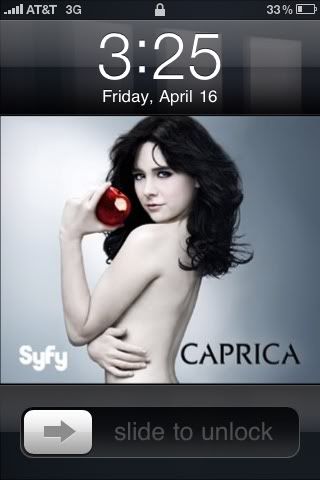
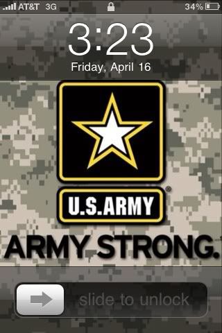
I alternate between the two.
~ Teh Slapz

TaxiService wrote:OMG BARREL ROLL ON ACIDS
._. \·. |: /.· .-. ·.\  .·/ ._. \·. |: /.· .-. ·.\ .·/ ._.
WHOOHHAGHGHHGEHGR
-
Noodle
- Delta Force
- Posts: 4763
- Joined: Wed Aug 29, 2007 7:11 pm
Post
by Noodle » Fri Apr 16, 2010 4:43 am
I like the US Army one. But their "Army Strong" campaign makes me want to to kill a baby.
Why can't it be "The Few the Proud"?

Who is online
Users browsing this forum: No registered users and 2 guests